-
Shop
- Adidas
- Advanced Technologies
- AI Skills
- AI Skills Mastery 2026 Collection
- Bathroom
- Best-Sellers
- Calvin Klein
- Car Accessories
- Confidence
- Dating & Social Skills
- Digital Resources
- AI & Technology
- Beauty
- Car Buying & Ownership
- Cozy Feast Collection
- Electronics & Technology
- Financial Education
- Hobbies
- Home Styling & Organization
- Kitchen & Recipes
- Mindset
- Online Business
- Parenting & Child Development
- Personal Style & Fashion
- Pet Lifestyle & Wellness
- Smart Life with AI
- Travel Planning
- Wellness
- Yoga & Fitness
- Education & Learning
- Family & Parenting
- Fashion
- Alexander McQueen
- Bags
- Bags & Wallets
- Balenciaga
- Belts
- Blazers
- Blouses & Shirts
- Bottega Veneta
- Brunello Cucinelli
- Burberry
- Chanel
- Chloé
- Dior
- Dolce & Gabbana
- Dresses
- Etro
- Fendi
- Gucci
- Hats & Hair Accessories
- Jacquemus
- Jewelry
- Jil Sander
- Keychains
- Kiton
- Luggage
- Luggage Bags
- Miu Miu
- Off-White
- Outerwear
- Prada
- Rick Owens
- Saint Laurent
- Scarves
- Shoes
- Socks & Tights
- Sunglasses
- The Row
- Tom Ford
- Valentino
- Valentino Garavani
- Versace
- Vivienne Westwood
- Watches
- Fashion Accessories
- Furniture
- Gadgets
- Health & Beauty
- Health & Wellness
- Home & Garden
- Home Decor
- Home Electronics
- Home Supplies
- Kids & Babies
- Kitchen
- Kitchen Best-Sellers
- Lighting
- Online Business for Beginners
- Patio, Lawn & Garden
- Personal Growth
- Pet Care
- Pet Supplies
- Pets
- Smart Amazon Shopping
- Smart Home Living Guides
- Sport & Outdoors
- Stress Relief & Relaxation
- Super Deals
- TikTok Growth & Monetization Mastery
- Travel
- Travel & Adventure
- Wealth
- Wealth Building
- Budgeting & Saving
- Cryptocurrency Investing
- Debt Management
- Entrepreneurship & Business Growth
- Family Finance & Budgeting
- Financial Independence
- Financial Mindset & Psychology
- Financial Planning
- Frugal Living & Expense Hacks
- Goal Setting
- High-Income Skills
- Investing Basics
- Leadership
- Motivation
- Networking & Mentorship
- Passive Income Strategies
- Real Estate Investing
- Side Hustles
- Stock Market Investing
- Popular
- Best deals
- Blog
Color Psychology in Clothing: Signals, Pairings & Fit
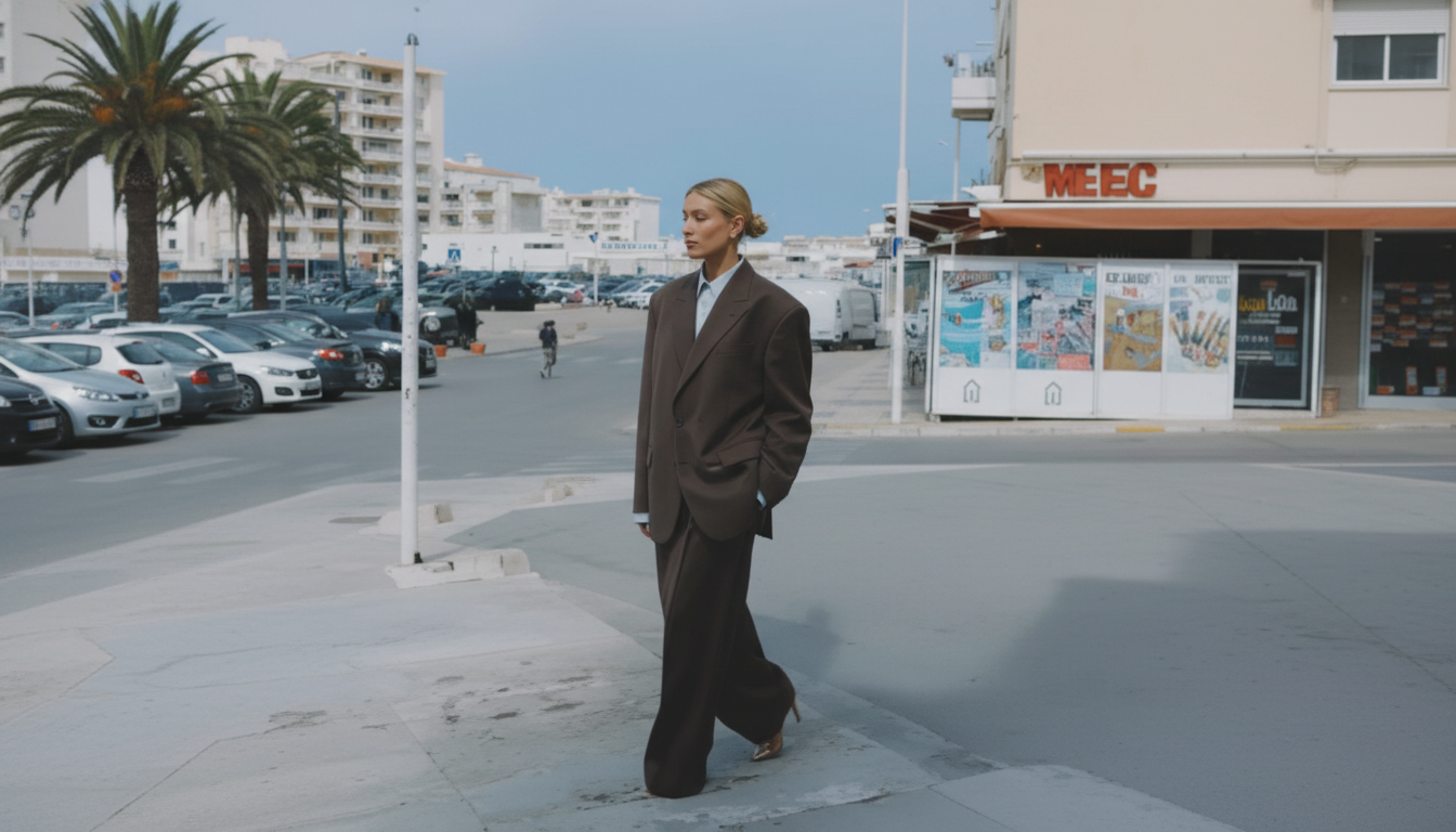
Why color feels so personal (and why it still sends signals)
Clothing color lands fast. Long before someone registers details like fabric or fit, the brain tends to file color into “quick meaning” buckets—calm vs. intense, traditional vs. modern, high-energy vs. understated. That speed is why color can shape first impressions so effectively.
At the same time, color is deeply personal. A shade that reads “confident” to one person might feel “aggressive” to another because of background, memories, uniforms, or even a specific event attached to that hue. In practice, that means color psychology works best as a set of probabilities rather than guarantees.
Context does a lot of the heavy lifting. Bright red can feel celebratory at a party, persuasive in a pitch meeting, and out of place at a solemn occasion. Even within the same setting, materials and styling change the signal: matte finishes read quieter and softer, while glossy or satin finishes read louder and more “look-at-me.” Structured silhouettes (blazers, sharp trousers, tailored coats) often make any color feel more authoritative than the same color in a slouchy knit or oversized hoodie.
For deeper background on how color perception works and why meaning shifts, see references from Britannica’s overview of color and research accessible through NIH PubMed.
A practical map of color impressions for outfits
A helpful way to use color is as a “signal amplifier,” not a mask. The most convincing looks usually match the mood already intended—calm, bold, grounded, playful, creative—then support it with cut, texture, and proportion.
When building an outfit, start simple: pick one dominant color, one supporting color, and add a neutral to keep the look wearable. If a color feels too intense, shifting the intensity (muted, dusty, heathered, washed) is often easier than switching color families completely. A muted version of a favorite shade can become a daily staple.
Common color associations in clothing (and when they work best)
| Color family | Often perceived as | Best for | Easy pairing neutrals |
|---|---|---|---|
| Black | Polished, serious, sleek | Evening events, formal settings, minimalist looks | White, charcoal, camel |
| White / Cream | Clean, fresh, open | Warm-weather looks, professional basics, elevated casual | Navy, tan, gray |
| Navy / Deep blue | Trustworthy, composed | Interviews, presentations, smart casual | White, camel, light gray |
| Red (bright) | Bold, energized, attention-grabbing | Statement pieces, events, confident accents | Black, white, denim |
| Burgundy / Wine | Refined, grounded intensity | Fall/winter outfits, dressy casual, workwear | Cream, navy, charcoal |
| Yellow (bright) | Optimistic, playful, high-visibility | Casual days, creative settings, accents | Navy, white, denim |
| Green (mid to deep) | Balanced, steady, nature-linked | Everyday wear, approachable professionalism | Cream, brown, black |
| Pastels | Gentle, approachable, romantic | Daytime events, soft tailoring, spring looks | Gray, navy, beige |
| Earth tones (tan, rust, olive) | Warm, reliable, grounded | Capsule wardrobes, relaxed sophistication | Cream, black, denim |
| Purple (deep) | Distinctive, expressive, luxurious | Evening looks, creative roles, statement styling | Black, gray, cream |
Choosing colors based on the outcome (not the trend)
Color decisions get easier when they’re tied to a result. Instead of asking “What’s in right now?” it helps to ask “What do I want this outfit to communicate?”
- To appear more approachable: choose softer contrast and mid-light values like cream, dusty blue, sage, and warm gray. These tend to feel open and collaborative.
- To appear more authoritative: lean into darker values and clear contrast—navy with white, charcoal with black, or structured monochrome. The structure matters as much as the shade.
- To appear more creative: use a controlled “unexpected” color. One bright accent (shoes, bag, top under a blazer) often reads more intentional than multiple competing brights.
- To reduce decision fatigue: build a base palette of two or three neutrals plus two accents that all mix. That small system can create dozens of combinations without overthinking.
- For photos and video calls: consider mid-saturation tones that read clearly on camera. Extremely saturated colors near the face can reflect onto skin and shift how complexion appears.
Color and emotion are linked, but the effect depends on shade, lighting, and personal association. The American Psychological Association is a useful starting point for understanding why the topic is complex rather than one-size-fits-all.
Undertone, contrast, and how color interacts with skin and hair
Undertone is often discussed as a strict warm-vs.-cool rule, but real-life harmony is usually a mix of undertone, contrast, and saturation. If a “correct” color still looks off, it’s often because the intensity is too high (or too low) for your natural contrast.
Using color strategically: accents, proportions, and “anchor” pieces
Culture, workplace norms, and the limits of “universal” meanings
Putting it into practice with guides and checklists
For a ready-made framework, the Psychology Behind Color Choices in Style – 3-in-1 Bundle | Psychology of Color in Clothing Guides, eBooks & Checklists collects practical references (meaning breakdowns, wardrobe prompts, and outfit-building support) so color decisions feel consistent instead of random.
To support a calmer morning routine—especially on days when decision fatigue makes styling harder—pair wardrobe structure with a simple habit reset like The No-Phone Morning Ritual Checklist: Reset Your Mind Before You Scroll | Digital Download | Printable Self-Care Checklist | The No-Phone Morning Ritual for a Clear Mind.
And if personal style extends into the space where you get ready, a décor piece that reinforces fashion inspiration—like the Elegant Ceramic Dress Form Vase – Abstract Fashion Sculpture Home Decor—can make the “getting dressed” area feel more intentional.
FAQ
Is color psychology real
Color can influence perception and emotion, but the effect varies by context, culture, personal experience, and the exact shade and saturation. It’s most useful as a practical guide for shaping first impressions—not a guaranteed formula.
Recommended for you

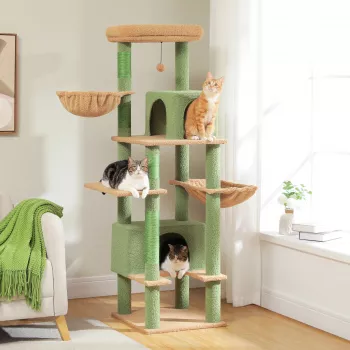
Stable Cat Tree Guide: Base, Posts, and Wall Anchors
May 29, 2026








Leave a comment